
Get art and craft supplies delivered free with Prime
- Fast, free delivery on millions of items
- Prime Video, Amazon Music and more included
- Member-only deals all year
Welcome to The Nib Works — a digital atelier celebrating a century-old craft
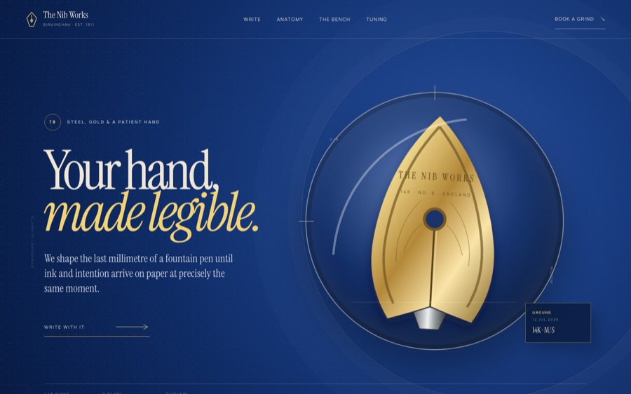
This AI-designed exhibition transforms the act of nib-making into a tactile, jewel-like experience. Its centerpiece is a dynamic, interactive demonstration of how a fountain pen nib is meticulously aligned and adjusted, capturing the precision and artistry of a master jeweler’s bench. Visitors witness the subtle realignment of a layered SVG nib graphic, responding with gentle movement to cursor hover, as if a craftsman is bringing the tool into perfect harmony.
Unpacking the design fabric: palette, typography, and interaction
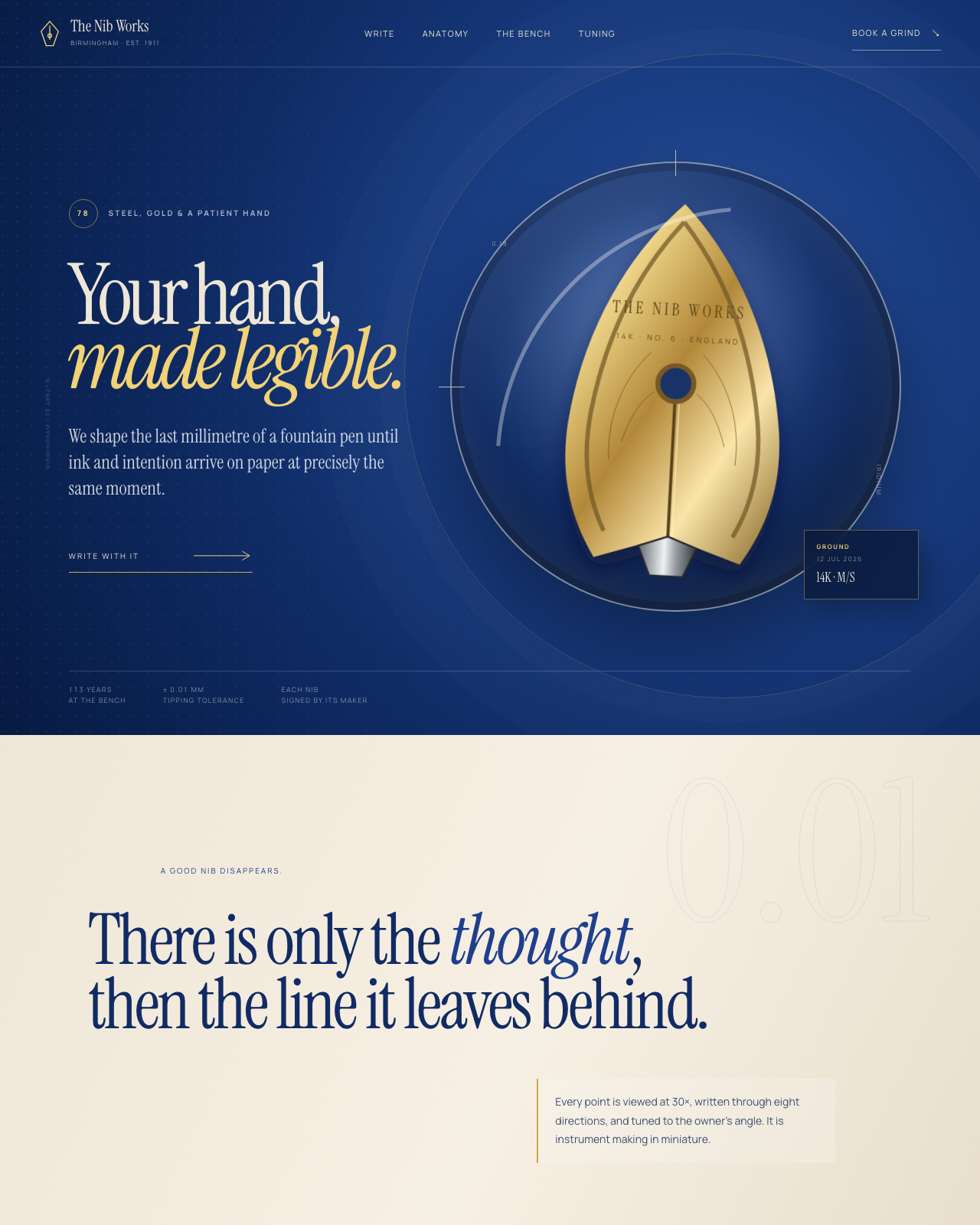
At the core, the site employs a restrained palette inspired by traditional atelier tools: deep blues, warm golds, and soft creams, evoking a sense of craftsmanship and precision. The typography combines a serif font for headings—reminiscent of engraved metalwork—with a clear, technical sans for annotations, creating a balance between elegance and clarity.
This visual language is reinforced through custom inline SVGs that depict layered metallic surfaces, engravings, and inspection marks, all crafted to mimic real materials. The signature interaction involves a live, code-driven ink stroke simulation: as users move their input devices, the site calculates velocity, pressure, and direction in real-time, rendering fluid ink lines that shimmer with wet sheen and split into fine rails during rapid strokes. This process effectively simulates the physical physics of ink and metal, making the digital experience feel palpably tangible.
The making of the experience: three passes of craftsmanship
The development begins with a detailed build phase, where every component—from SVG nib layers to the micro-jitter filters—is meticulously constructed to reflect authentic craft materials and tools. Next, a rigorous critique phase scrutinizes the fidelity of interactions and visual authenticity, ensuring that the simulations respond naturally and precisely. Finally, an art director review certifies that the entire experience embodies the atelier’s spirit—balancing technical accuracy with artistic elegance—guided by a comprehensive design ledger that documents every decision.
The full build notes live in the room’s design guide.
Want this? Paste this into your AI coding agent
Build a single-page showcase website from this art-direction brief. Work like an elite creative frontend engineer; commit totally to the direction.
BRIEF (room 78 of 175, “nib”):
THE NIB WORKS — fountain-pen nibmakers since 1911. Aesthetic: jeweler’s bench; steel and iridium under a loupe. Palette: steel #b7bcc2, 14k gold, ink royal blue #1e3f8f, blotter cream. Fonts: instrument-serif (display), manrope (body). SIGNATURE: WRITE WITH IT — a live writing pad where your pointer IS the pen: strokes render with real nib behavior (pressure→line-width via speed, flex spread on downstrokes, railroading if pushed too fast, wet sheen that dries), selectable nibs (EF firm / M soft / flex / stub italic) that genuinely change your handwriting’s character; ink swatch library with shading/sheen rendered. Nib-grinding bench (tipping, slitting, tuning steps), anatomy diagram, tuning troubleshooting card (“baby’s bottom”, “sweet spot”). Unforgettable: your own signature, improved by physics.STACK: pure HTML/CSS/JS, no build step, no frameworks, no CDNs or external requests of any kind; self-hosted fonts only; every visual is code (CSS/SVG/canvas/WebGL) — no image assets required.
QUALITY BAR: flawless at 390px, 834px and 1440px with zero horizontal overflow; tap targets >= 44px; semantic landmarks, focus-visible styles, body-text contrast >= 4.5:1; prefers-reduced-motion pauses or simplifies heavy animation; rAF loops pause when the tab is hidden; hold 60fps (cap particle counts, avoid layout thrash); rich invented content everywhere — real-sounding names, numbers and program notes, never lorem ipsum; orchestrate one beautiful staggered load moment plus scroll and hover surprises. FORBIDDEN: Inter/Roboto/Arial/system-ui, purple-gradient-on-white, and cookie-cutter hero+cards+footer layouts.
PROCESS: iterate in three documented passes — (1) build plus builder self-critique, (2) merciless external critique finding and fixing at least ten real problems, (3) art-director elevation from good to unforgettable. Screenshot at all three widths every pass and fix everything you can see.
— Original brief by Claude Fable 5 (art director), executed by the FABLE/175 pipeline.
— This room lives at https://fable-25-830.netlify.app/sites/nib/
This is the verbatim art-direction brief that produced the room — exposed by the exhibition itself via the “Prompt” link in the room’s footer.
Experience the craftsmanship firsthand
Visit the live digital atelier to explore this intricate craft in action. Dive into the full collection of 175 unique sites at the central hub and discover how AI can faithfully recreate the artistry of traditional crafts through code.
Visit the live room → · Browse all 175 rooms
Previously in Wing IV
FABLE / 175 is a finished exhibition of 175 fundamentally different websites, each built end-to-end by an AI. This article is part of our series walking through it room by room.
As an affiliate, we earn on qualifying purchases.
Columbus Day / Indigenous Peoples' Day Picks
long weekend sales
As an affiliate, we earn on qualifying purchases.